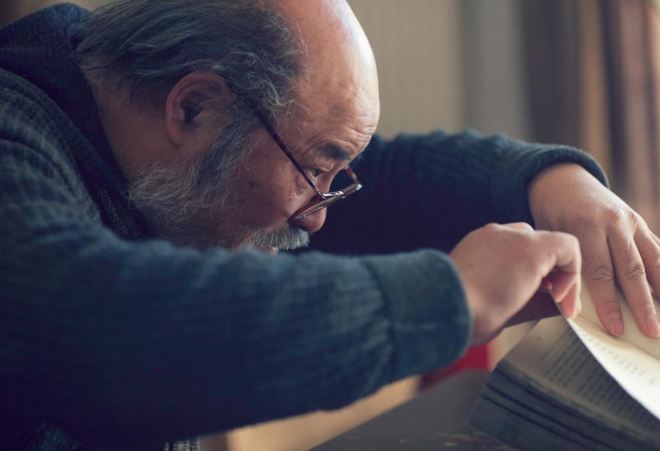
Lü Jingren sports a beard and a pair of round-framed spectacles.
His jovial eyes almost disappear when he breaks into his signature grin. People who know Lü by reputation describe him as one of China’s most accomplished book designers. But those who know him as a person understand that his fame belies a humble and amiable soul.
In his 38-year career, Lü has designed more than 2,000 books. He describes himself as a “busy pig,” a reference to his year of birth according to the Chinese zodiac and his irrepressible work ethic which, he admits, “is hard to change.” He even has a penchant for collecting pig-themed miniatures.
In 2009, one of Lü’s designs, a book entitled Chinese Memory, won the “Most Beautiful Book in the World” prize at the renowned Leipzig Book Fair. Other accolades bestowed upon Lü include being named one of the world’s “Top 10 Chinese Designers” by Guangxi Zhuang Autonomous Region’s A View on Publishing magazine and “Top 10 Asian Designers” by Taiwanese publication CommonWealth.
An upcoming solo exhibition of Lü’s work will be held in South Korea in October, and it will move to the US in February 2017. He and his disciples will also hold a joint exhibition in Beijing in 2017.
Zhang Kangkang, one of China’s most famous female writers, once said of Lü’s designs: “In the wobbling, flashy and virtual Internet age, [his] beautiful, substantial books are quietly providing a tangible sense of poetry in our lives.” Family Born in 1947 into a Shanghai family with five sons, Lü’s father was a silk merchant with a deep interest in culture and art. Lü’s upbringing had a lasting influence on his design work. His father set up a library for his children, stamping every book with a logo made up of the character Lü, their family name; “ren,” a given name shared by all five brothers; and the different characters preceding ren in the brothers’ names.
“I realized that characters could form patterns, which became a subconscious influence on my design,” Lü told NewsChina.
Beyond literature, Lü’s father’s interests also extended to traditional Chinese opera, calligraphy, painting, photography and sports. Lü remembered that in early summer, his father would spread his collection of paintings over the family’s balcony to get rid of unwanted moisture. He also built a darkroom to develop photographs in their home. His family held parties where slideshows and amateur puppet shows written and directed by friends and family were the main event.
Lü and one of his brothers were eventually sent to study painting.
Lü’s father invited foreign designers to design the logos, packaging and swatches for his company’s silk products. Lü admired their exquisite, unique patterns and ingenious use of characters, and began to collect his favorite examples of their art. What impressed him most, however, was how his father would painstakingly wrap each package in an orderly and precise way. Lü remembers his father’s resolute stance, slowly turning the six-sided presentation box in his hands, and quickly and neatly wrapping it in an elegant ribbon.
“I am always grateful for the inspiration I gleaned from my father.” Lü told NewsChina. “He helped me understand the relationship between form and content, and the rules of building harmony through order.” Director In 1978, the year China initiated Reform and Opening-up, Lü began work at China Youth Press as an “art editor.” His job was to design the covers of the publishing house’s books. At the time, he admitted to our reporter, there was barely any concept of “design,” especially of designing a book “as a whole.” China was emerging from decades of communist austerity and the iconoclastic anti-intellectualism of the Cultural Revolution. Beauty for its own sake was a new idea.
In 1989, Lü was offered the opportunity to study with Kohei Sugiura, one of Japan’s top graphic and book designers. In Japan, he said, many of Lü’s preconceptions about design were “overthrown.” “[In Japan] I learned that designing a book is more than drawing some pictures. It is about organizing information in a way that is
most conducive to reading,” Lü said.
In Japan, a book’s designer would meet with all parties involved in a book’s production: editor, writer, illustrator, papermaker and publisher.
Lü told News- China that Kohei Sugiura was like a director – he would provide a “complete solution” encompassing every detail of a book to integrate design with content. It was also while in Japan that Lü learned that the spaces left between Chinese characters on the page shouldn’t be made uniform: simpler characters should be closer together, while more complex ones should be a little further apart, allowing each set of strokes room to breathe.
Lü brought these new design ideas back to China. In his view, his process has three phases: decorative and graphic design (cover, materials and printing), layout (placement of text, illustrations, spacing and colorization) and editing (the visual impact of the text itself).
When Lü designed a new print edition of a biography of legendary Peking opera star Mei Lanfang in 2000, he received the book’s 350,000 characters from the editor, with no supplementary materials.
Lü suggested to the publisher that there should be abundant photography and illustration in a biography of such an accomplished, and visually impressive, performance artist. Through lengthy negotiation, Lü acquired consent from Mei Lanfang’s estate and collected more than 100 photos of Mei, allowing him to completely transform the layout of what would have been a very dry printing of a seminal work on one of China’s preeminent stage icons.
Gentleness Over the years, Lü began to discover that one of the most important aspects of design was what he describes as “mastering the esthetics of order.” In the 1970s and 1980s, typographic design in China mostly “followed the designers’ intuition.” Lü introduced the grid system, learned from Kohei Sugiura, into China.
The grid system of book design holds that all space on the page needs to be arranged with an invisible order which can form a harmonic interaction between all visual elements, from text to illustrations.
Lü’s designs adjust the scaling of all visual elements according to a precise mathematical formula. For example, when using a 16 point font size for a title, he uses 10 point for body text and 8 point for annotations, pegging all typeface sizes to base two.
“It’s a system of standards, which is the basis of design,” commented Zhang Zhiqi, a senior art editor at Higher Education Press.
Lü argues that his design concept is far from new. He cites the Yongle Canon, one of the world’s earliest and most comprehensive encyclopedias compiled by an estimated 2,000 Chinese scholars in the early 15th century. On close inspection of the text, Lü was surprised to find that the horizontal-vertical ratio used in the compendium’s layout is 1:0.626, which is very close to 1:0.618, the Golden Ratio celebrated in the classical Western tradition. He also found the spacing between characters, rows and paragraphs to follow specific patterns.
“This proves that the ancient Chinese had the concept of a grid system, though they did not refer to it as such,” Lü told our reporter.
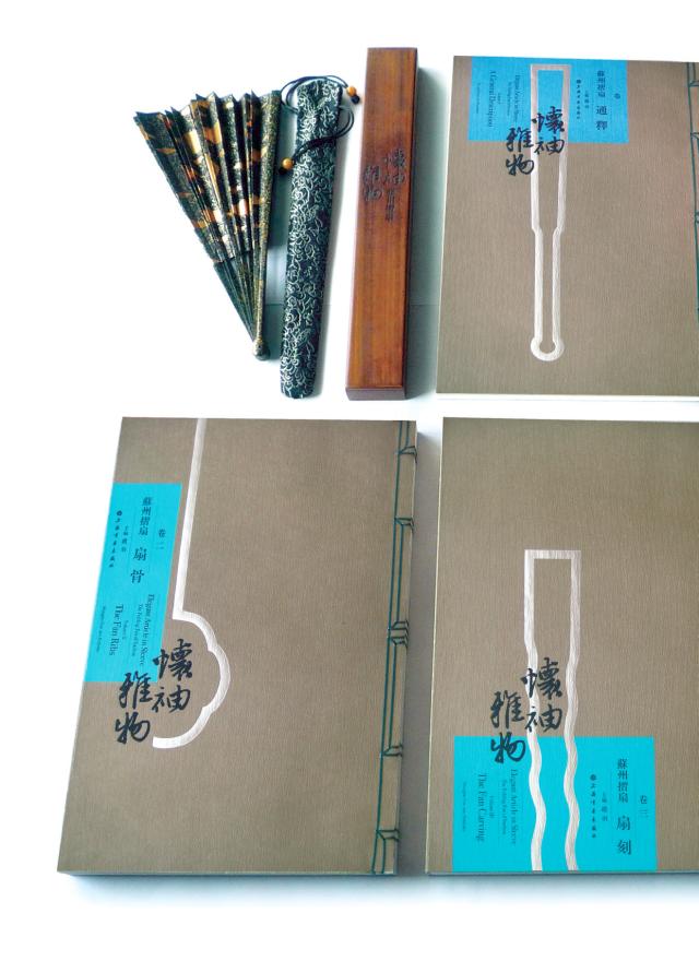
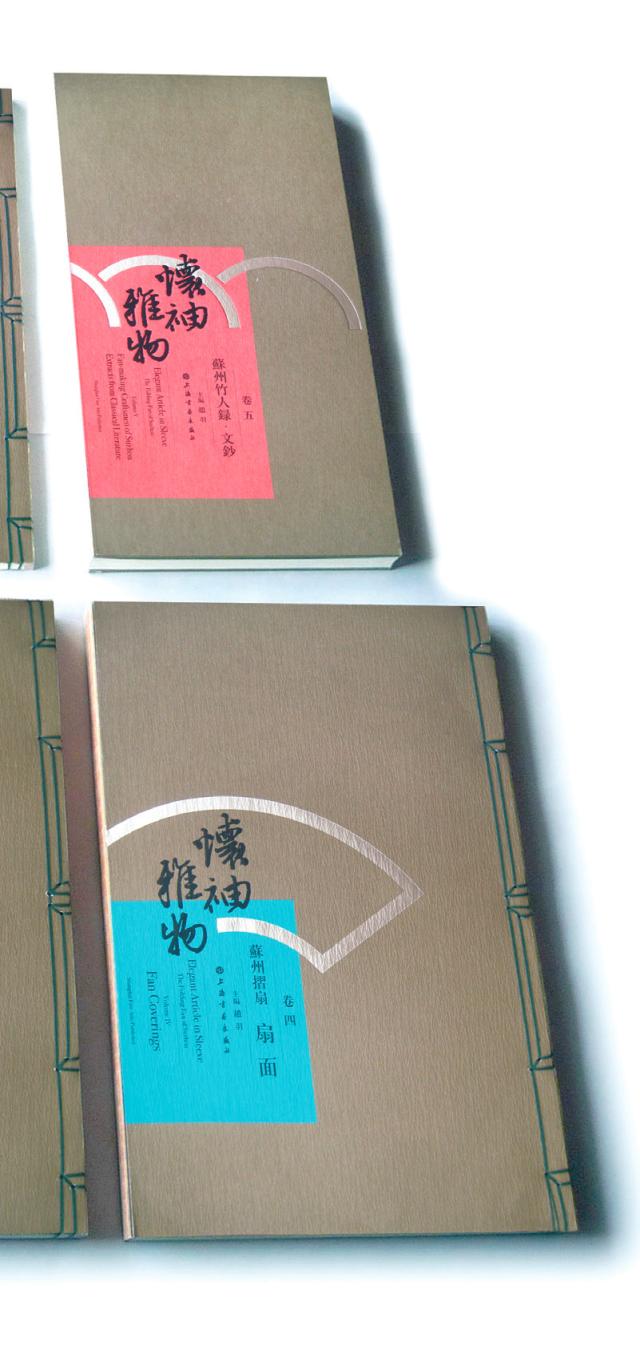
Lü often looks to the ancients for his inspiration. “I like the taste of classical Chinese design,” he said. One of his favorite books he was commissioned to design is an overview of the art of Suzhou folding fans, an art form in constant development since the Ming Dynasty (1368–1644). Lü integrated ancient thread-binding techniques into his design, along with scripture-style folding pages and other classical flourishes.
When asked to design a new edition of the 13th-century melodrama The Orphan of Chao that would ultimately be presented to foreign dignitaries (the tale is particularly popular in France), Lü chose to integrate both Chinese and Western elements into the design, ultimately creating two covers. One was inscribed with the characters that appear on a Ming Dynasty edition of the book, emblazoned on a scrolling Chinese ruyi motif. The “foreign” cover featured the book’s title in French and was decorated with a pattern of geometric curves.
The two covers were designed to represent cultural dialog between China and France.
Lü, now 69, still spends every day in his studio. He told NewsChina that although the age of the touchscreen has come, and even if one billion Chinese no longer read paper books, he’s still happy to design for “the remaining 400 million.” “I don’t think the book is going to disappear,” he said. “The key is that those cherished by their readers will be passed down from generation to generation as proof of the gentle refinement that reading once represented.”